在 WordPress 5.0+ 版本引入 Gutenberg 编辑器后,自定义 Block(区块)成为扩展编辑器功能的核心方式。相较于传统的短代码(Shortcode),Block 具备可视化编辑、实时预览、响应式适配等优势,能够极大提升内容创作体验。
在WordPress中,古腾堡区块(Gutenberg Block) 是一个功能强大的块编辑器,能够帮助用户更高效地创建和编辑内容。随着WordPress的不断发展,越来越多的开发者开始探索如何通过自定义区块(Custom Block)来增强内容创作的灵活性与可维护性。
为什么需要自定义 Block?
虽然古腾堡区块提供了丰富的内置块,但在某些情况下,用户可能需要更灵活的自定义块。例如:
- 自定义块样式(如颜色、边框、背景)
- 自定义内容结构(如分页、导航栏、侧边栏)
- 与插件或主题集成(如自定义字段、数据获取)
注册自定义块不仅可以提高内容的可扩展性,还能帮助用户更好地管理文章内容。
如果你是WordPress开发者,或者正在学习如何构建自定义内容,那么注册一个自定义古腾堡区块是提升你的内容创作能力的重要一步。本文将从基础原理、开发流程到实战优化,全面讲解如何开发符合 WordPress 规范的自定义 Block。
一、核心概念与开发环境准备
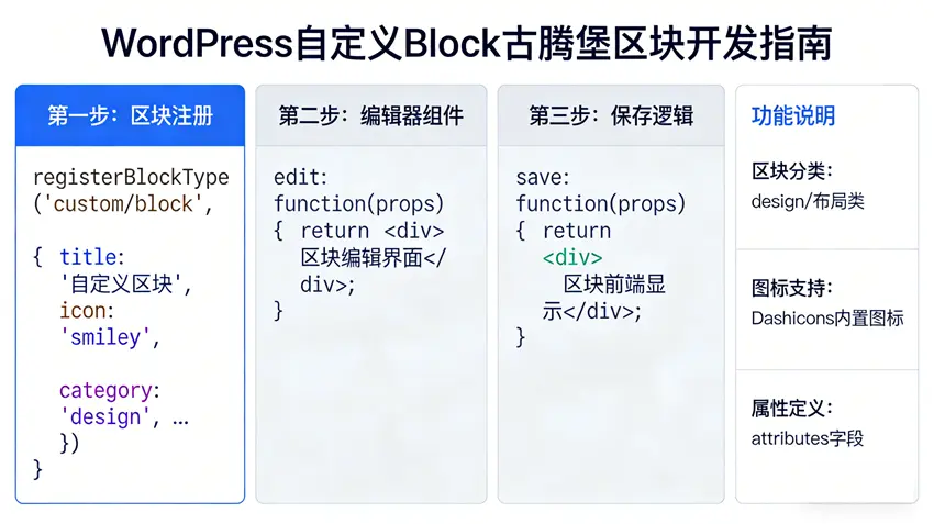
1.1 Block 核心构成
一个标准的 WordPress 自定义 Block 主要包含两部分:
- 客户端(Client-side):基于 React/JSX 编写的编辑器界面,负责区块的渲染、交互和属性配置;
- 服务端(Server-side):PHP 代码负责区块的注册、数据验证和前端展示渲染(可选,也可通过 React 前端渲染)。
1.2 开发环境要求
- WordPress 5.9+(推荐 6.0+,API 更稳定);
- Node.js 16+ 及 npm/yarn(用于编译 JSX/ES6 代码);
- @wordpress/scripts 工具包(WordPress 官方提供的构建工具);
- 本地开发环境(如 XAMPP、Local by Flywheel 或 Docker)。
1.3 环境初始化
首先在主题或插件目录下创建区块开发目录,以插件形式开发为例(推荐插件形式,解耦主题):
# 创建插件目录
mkdir wp-custom-block && cd wp-custom-block
# 初始化 package.json
npm init -y
# 安装核心依赖
npm install @wordpress/scripts --save-dev
修改 package.json 中的 scripts 字段,添加编译命令:
{
  "scripts": {
    "start": "wp-scripts start",
    "build": "wp-scripts build",
    "format": "wp-scripts format",
    "lint:css": "wp-scripts lint-style",
    "lint:js": "wp-scripts lint-js"
  }
}
二、基础自定义 Block 开发实战
2.1 目录结构设计
规范的目录结构便于维护,推荐结构如下:
wp-custom-block/
├── build/                # 编译后的代码(自动生成)
├── src/                  # 源代码目录
│   ├── block.json        # Block 配置文件(核心)
│   ├── edit.js           # 编辑器端渲染逻辑
│   ├── save.js           # 前端保存/展示逻辑
│   └── index.js          # 入口文件
├── wp-custom-block.php   # PHP 注册入口
├── package.json          # 依赖配置
└── README.md             # 说明文档
2.2 核心文件编写
1. block.json(区块配置文件)
block.json 是 WordPress 6.0+ 推荐的配置方式,集中定义区块的元信息:
{
  "$schema": "https://schemas.wp.org/trunk/block.json",
  "apiVersion": 2,
  "name": "custom/hello-world", // 区块唯一标识(命名空间/区块名)
  "title": "Hello World 区块",  // 编辑器中显示的名称
  "category": "widgets",        // 分类(text/media/widgets/design/embed等)
  "icon": "smiley",             // 图标(WordPress dashicons 名称)
  "description": "一个简单的自定义Hello World区块",
  "keywords": ["hello", "自定义", "示例"],
  "attributes": {               // 区块属性(数据存储)
    "content": {
      "type": "string",
      "default": "Hello, WordPress!"
    },
    "textColor": {
      "type": "string"
    }
  },
  "supports": {                 // 支持的功能
    "html": false,              // 禁用HTML编辑
    "color": {
      "text": true,             // 启用文字颜色设置
      "background": true        // 启用背景色设置
    },
    "typography": {
      "fontSize": true          // 启用字体大小设置
    }
  },
  "editorScript": "file:./build/index.js", // 编辑器脚本
  "editorStyle": "file:./build/index.css", // 编辑器样式
  "style": "file:./build/style-index.css"  // 前端展示样式
}
2. edit.js(编辑器端渲染)
负责区块在编辑器中的可视化编辑界面,基于 React 编写:
import { __ } from '@wordpress/i18n';
import { useBlockProps, RichText } from '@wordpress/block-editor';
import './editor.scss';

export default function Edit({ attributes, setAttributes }) {
  const blockProps = useBlockProps();

  // 处理内容变更
  const onChangeContent = (newContent) => {
    setAttributes({ content: newContent });
  };

  return (
    <div {...blockProps}>
      <RichText
        tagName="p"
        placeholder={__('输入自定义文本...', 'wp-custom-block')}
        value={attributes.content}
        onChange={onChangeContent}
        style={{
          color: attributes.textColor,
          fontSize: attributes.fontSize?.size || '16px'
        }}
      />
    </div>
  );
}
3. save.js(前端展示渲染)
定义区块在前端页面的展示样式,输出最终的 HTML 结构:
import { useBlockProps, RichText } from '@wordpress/block-editor';

export default function save({ attributes }) {
  const blockProps = useBlockProps.save();

  return (
    <div {...blockProps}>
      <RichText.Content
        tagName="p"
        value={attributes.content}
        style={{
          color: attributes.textColor,
          fontSize: attributes.fontSize?.size || '16px'
        }}
      />
    </div>
  );
}
4. index.js(入口文件)
注册区块并关联编辑 / 保存逻辑:
import { registerBlockType } from '@wordpress/blocks';
import { __ } from '@wordpress/i18n';
import Edit from './edit';
import save from './save';
import metadata from './block.json';

// 注册区块
registerBlockType( metadata.name, {
  title: __( metadata.title, 'wp-custom-block' ),
  description: __( metadata.description, 'wp-custom-block' ),
  edit: Edit,
  save,
} );
5. wp-custom-block.php(PHP 注册入口)
负责在 WordPress 中注册区块,加载编译后的资源:
<?php
/**
 * Plugin Name: WP 自定义 Block 示例
 * Plugin URI: https://example.com/
 * Description: 自定义 Block 开发示例
 * Version: 1.0.0
 * Author: 开发者名称
 * Text Domain: wp-custom-block
 * Domain Path: /languages
 */

// 防止直接访问
if ( ! defined( 'ABSPATH' ) ) {
	exit;
}

/**
 * 注册区块
 */
function wp_custom_block_register_blocks() {
	// 检查是否支持 Block API
	if ( ! function_exists( 'register_block_type' ) ) {
		return;
	}

	// 注册区块
	$block_json_path = plugin_dir_path( __FILE__ ) . 'src/block.json';
	register_block_type( $block_json_path );

	// 加载翻译
	load_plugin_textdomain( 'wp-custom-block', false, basename( dirname( __FILE__ ) ) . '/languages' );
}
add_action( 'init', 'wp_custom_block_register_blocks' );

/**
 * 仅在编辑器加载时加载样式/脚本
 */
function wp_custom_block_enqueue_assets() {
	// 前端样式(可选)
	wp_enqueue_style(
		'wp-custom-block-frontend',
		plugin_dir_url( __FILE__ ) . 'build/style-index.css',
		array(),
		filemtime( plugin_dir_path( __FILE__ ) . 'build/style-index.css' )
	);
}
add_action( 'wp_enqueue_scripts', 'wp_custom_block_enqueue_assets' );
2.3 编译与测试
- 编译代码:执行以下命令编译 JSX/ES6 代码和 SCSS 样式:
# 开发环境(实时监听修改)
npm run start

# 生产环境(压缩编译)
npm run build- 安装插件:将
wp-custom-block目录复制到 WordPress 的wp-content/plugins/目录下; - 启用插件:在 WordPress 后台「插件」页面启用「WP 自定义 Block 示例」;
- 测试区块:新建 / 编辑文章,在编辑器中搜索「Hello World 区块」,插入后即可编辑内容、修改颜色和字体大小。
三、进阶开发技巧
3.1 服务端渲染(SSR)
对于需要动态数据(如数据库查询、用户信息)的区块,推荐使用服务端渲染,避免前端数据泄露:
// 在 wp-custom-block.php 中添加服务端渲染回调
function wp_custom_block_render_callback( $attributes, $content ) {
	// 获取动态数据
	$current_user = wp_get_current_user();
	$greeting = sprintf(
		__( 'Hello, %s! 当前时间:%s', 'wp-custom-block' ),
		$current_user->display_name ?: 'Guest',
		current_time( 'Y-m-d H:i:s' )
	);

	// 渲染 HTML
	return sprintf(
		'<div class="wp-custom-block-hello-world">
			<p style="color:%s">%s</p>
		</div>',
		esc_attr( $attributes['textColor'] ?? '#333' ),
		esc_html( $greeting )
	);
}

// 修改区块注册,添加渲染回调
register_block_type( $block_json_path, array(
	'render_callback' => 'wp_custom_block_render_callback',
) );
3.2 区块属性高级配置
支持更复杂的属性类型(如对象、数组),并添加验证规则:
// block.json 中扩展 attributes
"attributes": {
  "buttonText": {
    "type": "string",
    "default": "点击查看"
  },
  "buttonLink": {
    "type": "object",
    "default": {
      "url": "",
      "title": "",
      "target": "_self"
    }
  },
  "showButton": {
    "type": "boolean",
    "default": true
  }
}
3.3 集成 WordPress 组件
使用 @wordpress/components 提供的官方组件提升交互体验:
// edit.js 中添加按钮链接设置
import { Button, URLInput } from '@wordpress/components';

// 在 Edit 组件中添加
<div>
  { attributes.showButton && (
    <div className="wp-custom-block-button-setting">
      <URLInput
        value={ attributes.buttonLink.url }
        onChange={ ( url ) => setAttributes({
          buttonLink: { ...attributes.buttonLink, url }
        }) }
      />
      <Button
        variant="primary"
        onClick={ () => setAttributes({ showButton: false }) }
      >
        { __( '隐藏按钮', 'wp-custom-block' ) }
      </Button>
    </div>
  ) }
</div>
四、最佳实践与优化
4.1 性能优化
- 使用
npm run build编译生产版本,移除调试代码; - 按需加载组件,避免引入未使用的 WordPress 模块;
- 前端样式使用 CSS 变量,适配 WordPress 主题风格;
- 避免在
edit组件中执行复杂计算,可使用useMemo/useCallback缓存结果。
4.2 兼容性处理
- 兼容低版本 WordPress:通过
wp_script_add_data添加defer和type="module"; - 适配响应式:使用
@wordpress/viewport检测屏幕尺寸; - 多语言支持:使用
__()函数包裹文本,生成.pot翻译文件。
4.3 调试技巧
- 启用 WordPress 调试模式(
wp-config.php中设置WP_DEBUG=true); - 使用浏览器开发者工具的 React DevTools 调试组件;
- 利用
@wordpress/debug输出调试信息; - 检查
wp-content/debug.log查看 PHP 错误。
五、发布与分发
- 打包插件:将编译后的
build目录、wp-custom-block.php等核心文件打包为 ZIP; - 版本管理:遵循 SemVer 语义化版本规范;
- 分发渠道:可提交至 WordPress 官方插件库,或通过私有仓库分发;
- 更新机制:集成 GitHub Updater 或 WP Update Server 实现自动更新。
总结
- WordPress 自定义 Block 核心由
block.json配置、前端 React 编辑逻辑、PHP 注册三部分构成,6.0+ 版本推荐使用block.json统一管理配置; - 开发时需区分编辑器端(
edit.js)和前端展示端(save.js)逻辑,动态数据推荐使用服务端渲染(render_callback); - 遵循 WordPress 官方规范,做好性能优化、兼容性处理和多语言支持,可大幅提升自定义区块的稳定性和用户体验。
通过本文的开发流程,你可以快速构建符合 WordPress 标准的自定义区块,扩展 Gutenberg 编辑器的功能,满足个性化的内容编辑需求。如需更复杂的功能(如嵌套区块、动态区块),可进一步学习 @wordpress/blocks 官方文档和 Gutenberg 开发手册。
在WordPress中注册自定义古腾堡区块是提升内容创作效率的重要方式。无论是为了增强内容灵活性,还是实现更复杂的交互功能,自定义块都能带来显著的好处。
如果你正在学习WordPress开发,建议从基础开始,逐步掌握自定义块的使用。通过不断实践,你将能够创造出更加丰富、灵活和功能强大的内容。
成为扩展编辑器功能的核心方式。相较于传统的短代码(Shortcode),Block 具备可视化编辑、实时预览、响应式适配等优势,能够极大提升内容创作体验。 在WordPress中,古腾堡区块(Gutenberg Bloc…) QQ
QQ


评论
抢沙发